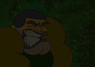
Throw down the character. If you have a dramatic scene and you want these highlights to pop, your character is gonna have to be what professionals call low key (or a low value). It's important not to just take the character and pull the value down, or just take the colors and darken them. It's important that the colors preserve their proper relationships, so that might mean dropping saturations or pumping them up a bit. I dropped the saturation of the pilots helmet and lips because they would've been far too saturated, and pumped up his arms because yellow gets really desaturated at low values. Anyway, I'll do a more labored post later about colors, but it's still important to try to think about these things.

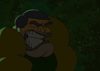
Highlights are on a separate layer. I find the color I want, and then set the layer to a low opacity. As with all the highlights, they will be flickering so the amount of opacity range you have really depends on the scene.

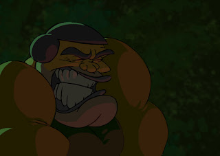
Then finally, I do the same for reflected light on the front. What's important is that these highlights should help to really wrap around the form. When I have them roughed in, I usually select the highlights and hit smooth a couple times just to make sure they look clean.

I'm a big fan of classical lighting, and I hope to exploit more techniques like this. Of course, this is just a frame of the scene, but you get the general principle of how I pull stuff like this off.
3 comments:
Neat stuff and funny drawings.
nice to meet you this weekend. looking forward to your WINGS OF DEATH!!!
Hey Chris,
This is looking good with all the lighting effects and stuff. I look forward to seeing it when it's all said and done
cool lighting. i suck at lighting techniques. this looks like a good solid tension-filled scene. hahah
Post a Comment